Against List View
Published: March 1, 2017
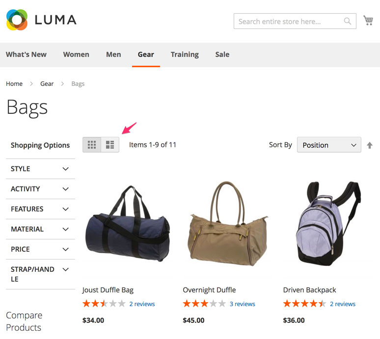
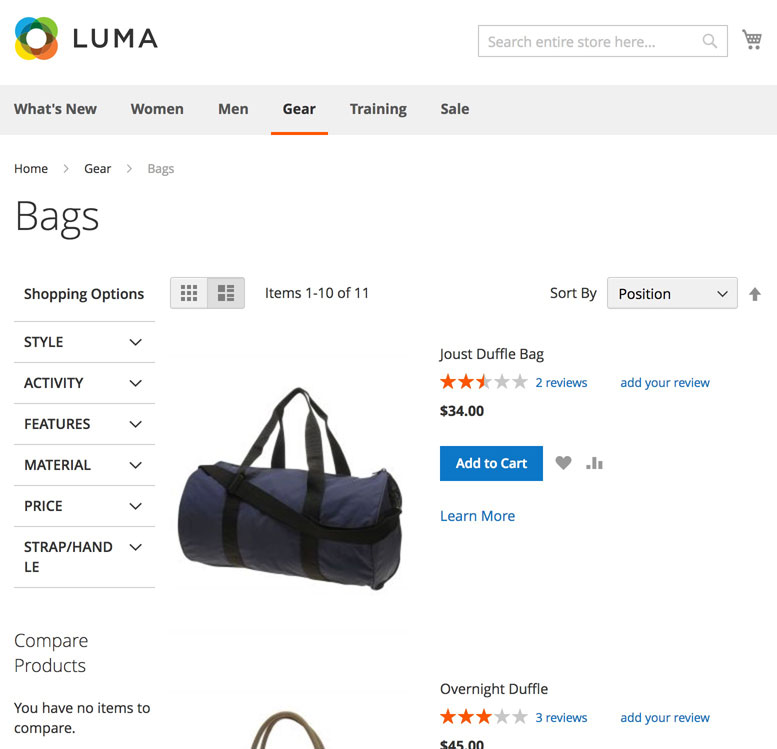
Out-of-box, both Magento 1 and 2 provides the ability to toggle between “Grid View” and “List View”.

“Grid View” displays the products in an image grid, as pictured above. It is the default “mode” for viewing a category or search results page.
In “List View” the products are listed in a single column as pictured below.

Not only is list view unnecessary, it’s also harmful. Here I’ll explain why…
Higher Cost
Supporting two methods of viewing a collection of products means everything needs to be duplicated..
- Design work is duplicated to account for both grid view and list view
- Development work is duplicated to implement both grid view and list view
- Testing effort is duplicated to test both grid view and list view
All these add up to significantly higher costs for the merchant.
Further, bugs are much more likely due to the fact that there are two possible places where they can occur. In my experience it is very common for developers to forget to test their features in both views. These bugs add additional cost to the merchant and leave a bad impression on any site user who experiences them.
Bad For FPC
You may not have also thought about this, but supporting multiple views for a single result set is bad for FPC…
- Decreases FPC hit rate as there are two possible variations of page that need to be in the cache
- Increases FPC storage requirements to store both variations of page
This means that the site is more likely to take longer to load for an end user and will be more taxing on your infrastructure.
It’s Useless
I checked Google Analytics and searched for “mode=list” under Behavior > All Pages on a few sites that have list view enabled. Only ~0.05% page views contained that term.
Turning It Off
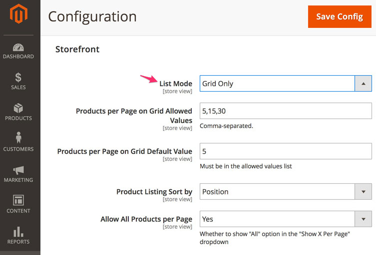
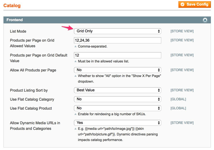
Grid view can be turned off in both Magento 1 and Magento 2 through the admin panel.
In Magento 2 navigate to Stores > Settings > Configuration > Catalog > Catalog > Storefront. Set “List Mode” to “Grid Only”.

In Magento 1 navigate to System > Configuration > Catalog > Catalog > Frontend. Set “List Mode” to “Grid Only”

Conclusion
If you have any counter arguments that support the use of list view I’d love to hear them. If, for whatever reason, you prefer list view to grid view, that’s fine. In that case I’d say disable grid view. Basically my argument is that it’s a bad idea to support two modes for viewing your category pages.
If you have any questions or comments, feel free to drop a note below, or, as always, you can reach me on Twitter as well.
 Hi, I'm Max!