Syntax Highlighting And Color Contrast Accessibility
Published: November 16, 2017
Recently I watched a video titled “Totally Tooling Tips: Accessibility Testing” published to the Google Chrome Developers YouTube Channel.
The video demos Chrome’s built in accessibility audit tool.
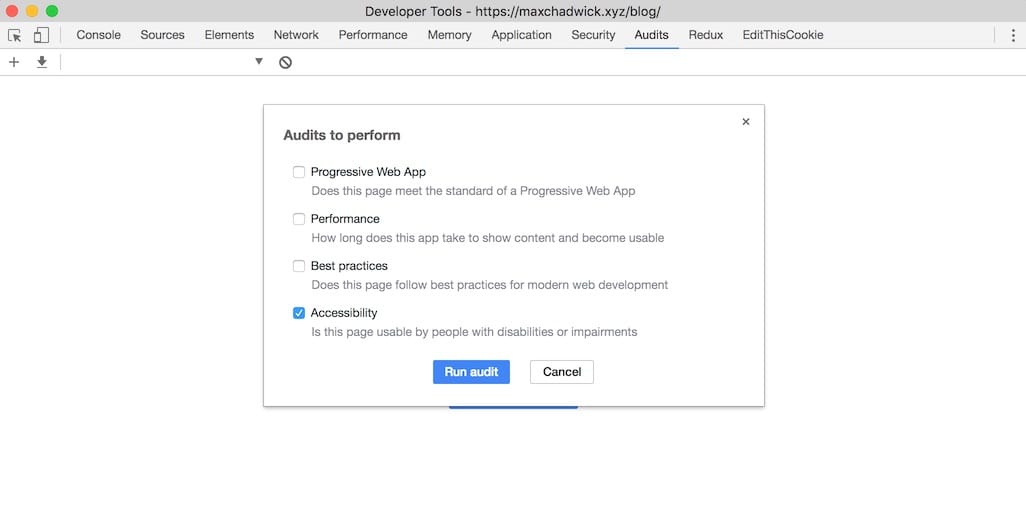
After watching the video I decided to run the tool against this site.
There were a few things I needed to fix to get this site to pass the audit. One of those things was the color contrast of the syntax highlighting I use for code snippets.
In this post I’ll explore that problem and talk about my approach to solving it.
My Initial Reaction
When I initially saw that syntax highlighting was causing the audit to fail, my reaction was “well, I don’t need to worry about that.”
However, as I thought about it more, I realized that there’s no reason that my code examples shouldn’t have sufficient contrast to be easily readable by users with color vision deficiency. After all, content I publish to my blog is not just for my own consumption (where I’m free to choose whatever syntax highlighting style I prefer), but rather to the internet for mass consumption amongst all its users.
As such, I set out to find a solution for the problem.
Searching For A Solution
At the time of writing this article, this blog is published with Jekyll, which uses Rouge, a ruby-based syntax highlighter that is compatible with pygments. I was personally using this stylesheet to apply the solarized-dark theme to my code snippets.
In my search for a solution for accessible stylesheets I pretty much came back empty handed. As such, I took matters into my own hand and darkened the background color to #000000 which was good enough to make my site pass the accessibility audit.
A Better Solution
I started to think about the problem more and realized it doesn’t seem to be something people are thinking about much…at least I couldn’t find much about it in my searching. As such, I began to form the idea of publishing a library of accessible stylesheets, that others can use on their websites.
Eventually I landed on an idea.
Introducing pygments-high-contrast-stylesheets
pygments-high-contrast-stylesheets is a hard fork of pygments-css with WCAG AA passing stylesheets.
At first, I was manually converting them, but eventually I built out a Ruby script which fully automates the process.
At the time of writing this there are 10 different stylesheets available, and they all pass the Chrome accessibility audit (which checks that they pass WCAG AA).
You can check out pygments-high-contrast-stylesheets on GitHub here and also preview demos of all the themes here.
Here’s a quick demo of the difference for solarized-dark
Before
After
To my eye the difference is subtle, but upon close inspection it is clear that the colors in the “after” example have been lightened and stand out better against the background than those of the “before” example.
 Hi, I'm Max!